Key Takeaways
- Accessibility works best when it is considered during planning and production, not added after the final cut.
- Captions, readable text, clear narration, thoughtful visual hierarchy, and audio description can make content usable by more people.
- Accessible choices benefit audiences beyond people with disabilities, including viewers watching without sound or working in a second language.
- Motion graphics should guide attention and clarify information rather than overload the screen.
- Designing for accessibility often produces simpler, clearer, and more effective communication overall.
Accessibility can sound like something that happens after the creative work is finished.
Export the final cut. Add captions. Check the box. Move on.
That view misses the more useful idea.
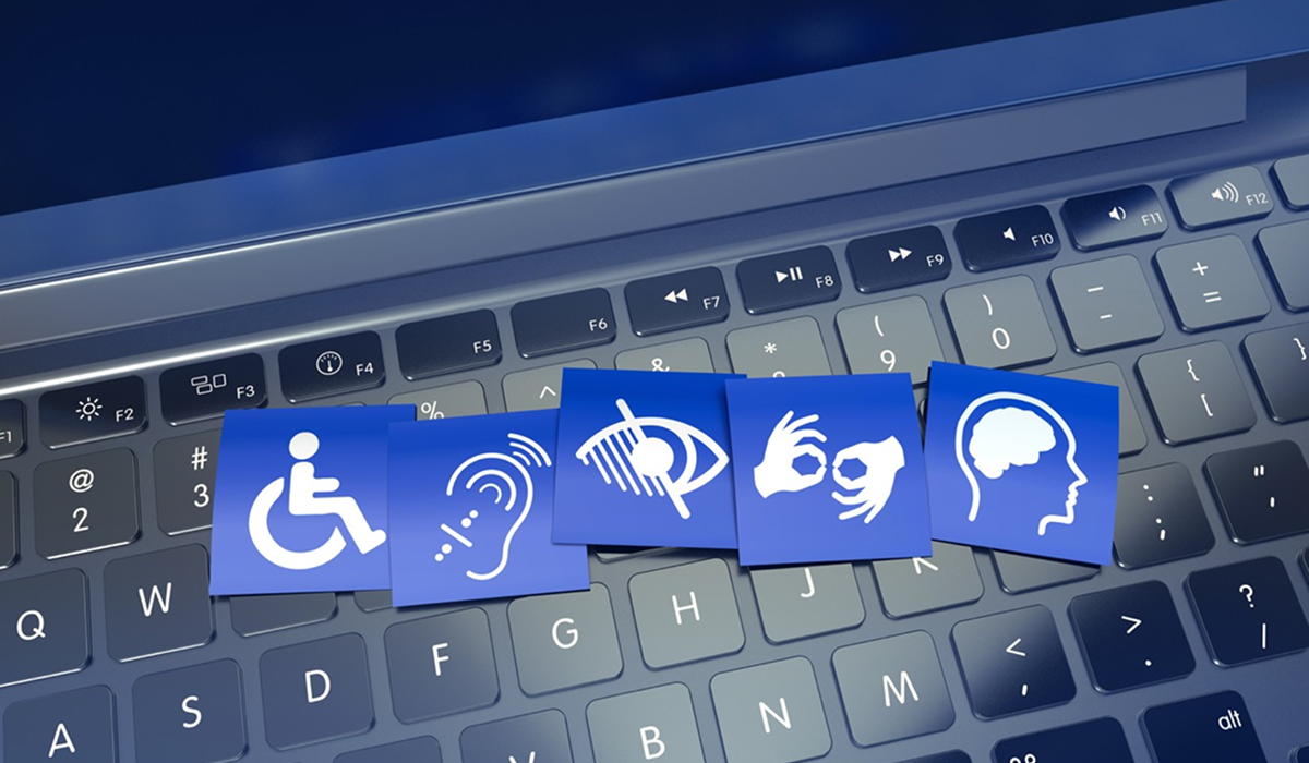
Accessible video is really about designing information so that more people can understand and use it. That includes viewers with hearing or visual disabilities, but it also includes the person watching a LinkedIn video with the sound off, an employee consuming training content in a second language, or a customer trying to follow an explainer in a noisy airport.
Once accessibility is understood that way, it stops looking like a separate production requirement. It starts looking a lot like good communication.
At Storyboard Studios, we believe accessibility works best when it enters the conversation early, while the script, storyboard, visual hierarchy, and distribution plan can still be shaped around it.
Captions Are The Beginning, Not The Whole Strategy
Captions are one of the most visible accessibility features in video, and for good reason. They make spoken information available to viewers who cannot hear the audio clearly, as well as the enormous number of people who simply have their devices muted.
But captions are not a magic layer that makes any finished video accessible.
They need to be accurate and readable. They need enough time on screen to be followed comfortably. Their placement matters. If important graphics, names, charts, or lower-thirds occupy the same area of the frame, captions can end up covering information that was never designed to share the space.
This is why accessibility is easier to build than to retrofit.
When a production team knows from the beginning that captions will be present, the composition can leave room for them. On-screen text can be timed more thoughtfully. Dense visual moments can be simplified. The final piece feels intentional instead of repaired.
Design For The Small Screen
Corporate videos are often created and reviewed on large monitors. A significant portion of the audience may eventually watch them on a phone.
That changes what “readable” means.
A chart that looks perfectly clear in an editing suite can become a cluster of tiny labels on a six-inch screen. A paragraph of animated copy may disappear before the viewer finishes the second line. Five visual elements arriving at once can turn a clean concept into noise.
Accessible design creates hierarchy. There is a main idea, an obvious place to look, and enough time to process what has appeared before the next thing arrives.
Those principles are useful for people with accessibility needs, but they are equally useful for anyone watching quickly between meetings. Accessibility frequently improves the experience for the entire audience because it forces the communication to become more deliberate.
Ask Whether The Story Still Works Without The Picture
A useful test is surprisingly simple: close your eyes and listen.
Does the story still make sense?
If the narration says, “As you can see here,” while the screen is carrying the most important information, some viewers have effectively been excluded from the message.
The solution does not always require a major rewrite. A line such as “Sales increased dramatically” could become “Sales increased 34 percent in twelve months.” Now the narration carries the essential information and the graphic reinforces it.
For videos in which important visual information cannot reasonably be incorporated into the primary narration, audio description can provide additional context. The appropriate approach depends on the content, audience, and distribution environment, but the underlying principle is consistent: essential meaning should not exist in only one channel if the audience may not be able to access that channel.
Ask The Opposite Question Too
Now mute the video.
Can you still follow the message?
This matters because digital video is frequently encountered without sound, sometimes by choice and sometimes because of the environment. Captions help, but good visual storytelling goes further. Important ideas can appear through concise on-screen text, diagrams, demonstrations, purposeful animation, or visual changes that remain understandable even when narration is unavailable.
The strongest videos allow audio and visuals to support each other. Neither should be forced to do all the work alone.
That balance also makes content more resilient. A social clip can still communicate on mute. A training video remains understandable to someone who misses a sentence. A viewer processing information in a second language has more than one way to follow the idea.
Accessibility Makes Creative Teams Edit Harder
There is an unexpected creative benefit to designing for accessibility: teams become less tolerant of clutter.
Long sentences get tightened. Graphics become clearer. Information appears in a more logical order. Important numbers are actually spoken instead of appearing for two seconds in the corner of the frame. Decorative animation that competes with the message becomes easier to cut.
The content gets simpler, but not less sophisticated.
That distinction matters. Clear communication is not the same thing as simple thinking. In fact, it often takes more thought to make a complicated idea feel easy to follow.
A strong accessible design asks the production team to decide what matters most and then make that hierarchy obvious. That is good creative discipline regardless of who is watching.
Build Accessibility Into The Brief
The best time to discuss accessibility is before the storyboard exists.
Where will people watch the video? Will captions be required? Does the audience include people using assistive technology? Will the content be distributed across several languages or regions? Are important visual elements explained verbally? How large does on-screen text need to be on mobile? Are colour and contrast choices doing enough work? Is there enough time for a viewer to read what appears?
These decisions are much easier to make while the production is still flexible.
Waiting until the end can create awkward compromises. Captions cover graphics. Text has to be resized. A voiceover needs to be rewritten because the visuals contain essential information that was never spoken. A tightly designed frame suddenly needs space it does not have.
Accessibility should not feel like repairing a video after it is finished. It should feel like designing the video properly from the start.
Common Mistakes To Avoid
One common mistake is assuming captions alone make a video fully accessible. They are important, but accessibility also involves how information is written, spoken, displayed, timed, and structured.
Another is designing primarily for desktop viewing when the real audience may be on smaller devices. Dense charts, tiny labels, and fast-moving paragraphs often fail long before they technically become unreadable.
Organizations should also be cautious about communicating essential information only through visuals. If the audience needs to see a specific number, process, or change in order to understand the message, consider how that information can also be carried through narration, captions, audio description, or another accessible format.
A Simple Test For Your Next Video
Take one of your existing videos and experience it three ways.
Watch it normally. Then watch it without sound. Finally, listen without looking at the screen.
Notice what disappears each time.
Those gaps are useful. They reveal where the video depends too heavily on one mode of communication and where the next production can become clearer.
Accessibility is often discussed as a requirement, and in some contexts it is. But creatively, it is also an opportunity. When more people can follow the story, the story is doing its job better.